Intuitive Conferences + Events
Intuitive Conferences + Events is a full-service conference and event planning company that offers strategic meeting management solutions tailored to their clients' unique needs. They alleviate the stress and uncertainty associated with conference and event planning.
Visit the website
Services Provided
Visual Identity
Web Design & Development
Art Direction
The Approach
The team at Intuitive wanted their visual identity and logo to represent their friendly approach to managing events because they work closely with their clients' team. They also needed to convey their sense of organization and ability to pivot at a moment's notice. Event management is a fast-paced environment that requires quick problem-solving and attention to detail.
Starting with a discovery call to determine their goals and learn about their target audience, it became obvious that they needed a logo that would translate the idea of "constant motion". From that, a logo started to take shape, as well as a color palette and typography. Through multiple rounds of collaborative work, the visual identity began to take its final form.
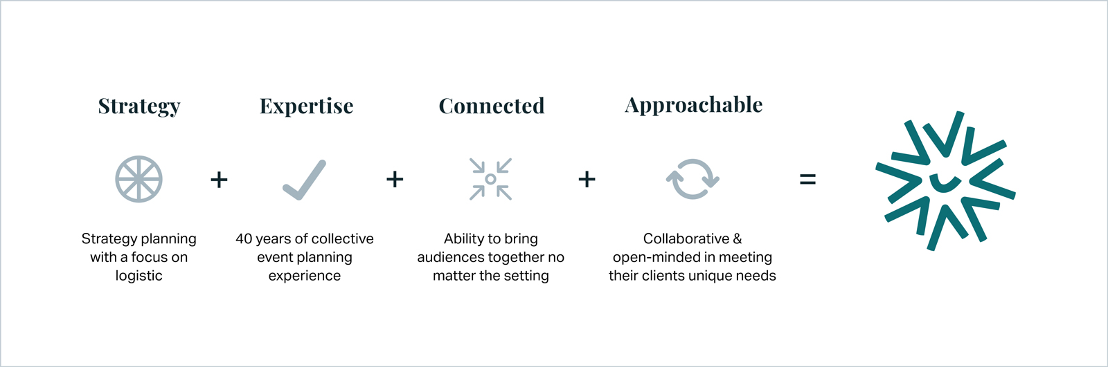
Symbol Concept
The symbol was born out of four core principles that align with their goals of offering stress-free, full conference, and event planning solutions.
Friendly but structured, the symbol combines a smile with checkmarks (getting things done). It reflects the honest, no-nonsense, hands-on approach of the team at Intuitive. Not to mention, their fondness for bad jokes, making their working style easy to integrate into any team.
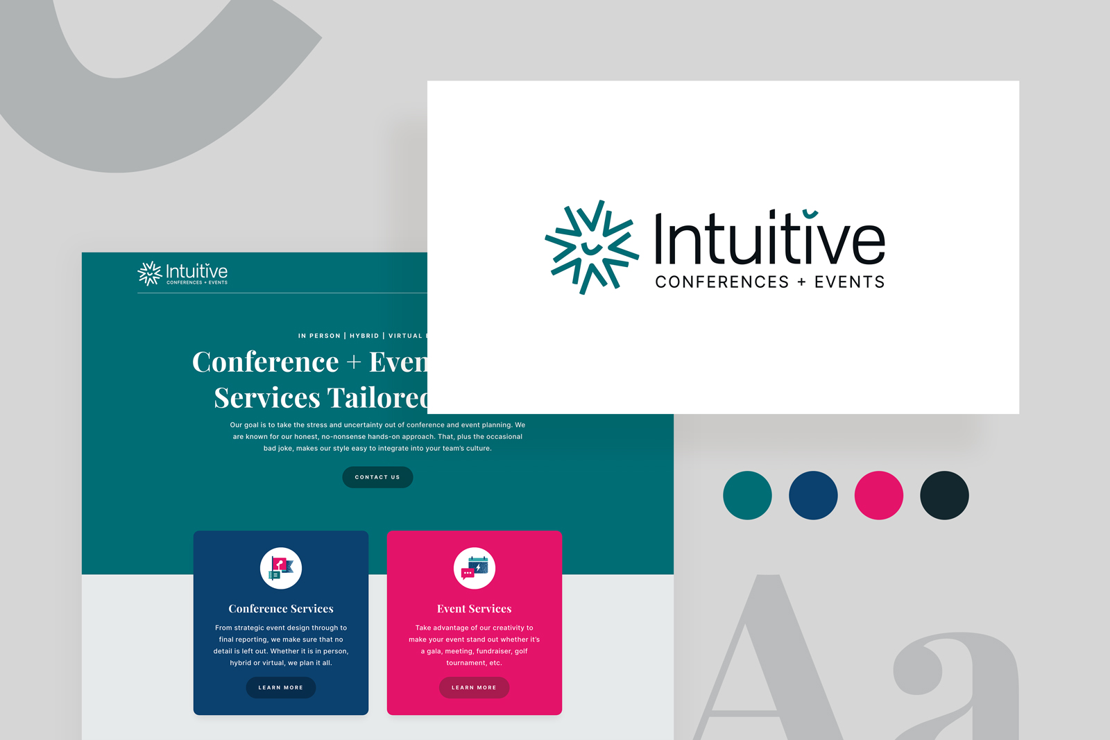
The Logo Lockup
It was important that the logo system work for both horizontal and vertical applications. Consider the square aspect ratio of a social media profile picture versus a horizontal website navigation bar.
The logo system contains two lockups: the primary horizontal lockup and the stacked vertical lockup. The symbol (mark) can be used alone as an avatar, a website favicon, or an accent element on marketing materials. The smile can be used alone as an image overlay or also as an accent element on marketing collateral.
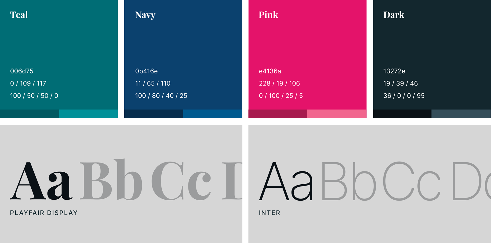
Brand Colours & Typography
Intuitive by nature. Teal combines the calming properties of blue with the renewing qualities of green. It is revitalizing, forward-thinking, and represents open communication and clarity of thought.
All hands on deck. Navy blue evokes feelings of confidence, responsibility, and commitment. It represents their no-nonsense, hands-on approach to conference and event planning.
People are at the heart of everything we do. Bright pink evokes creativity, innovation, and strength, while also inspiring hope, empathy, and caring for people.
The dark side. Every brand color palette needs black, but not a true black. A subdued black is much easier on the eyes and blends well with other brand colors.
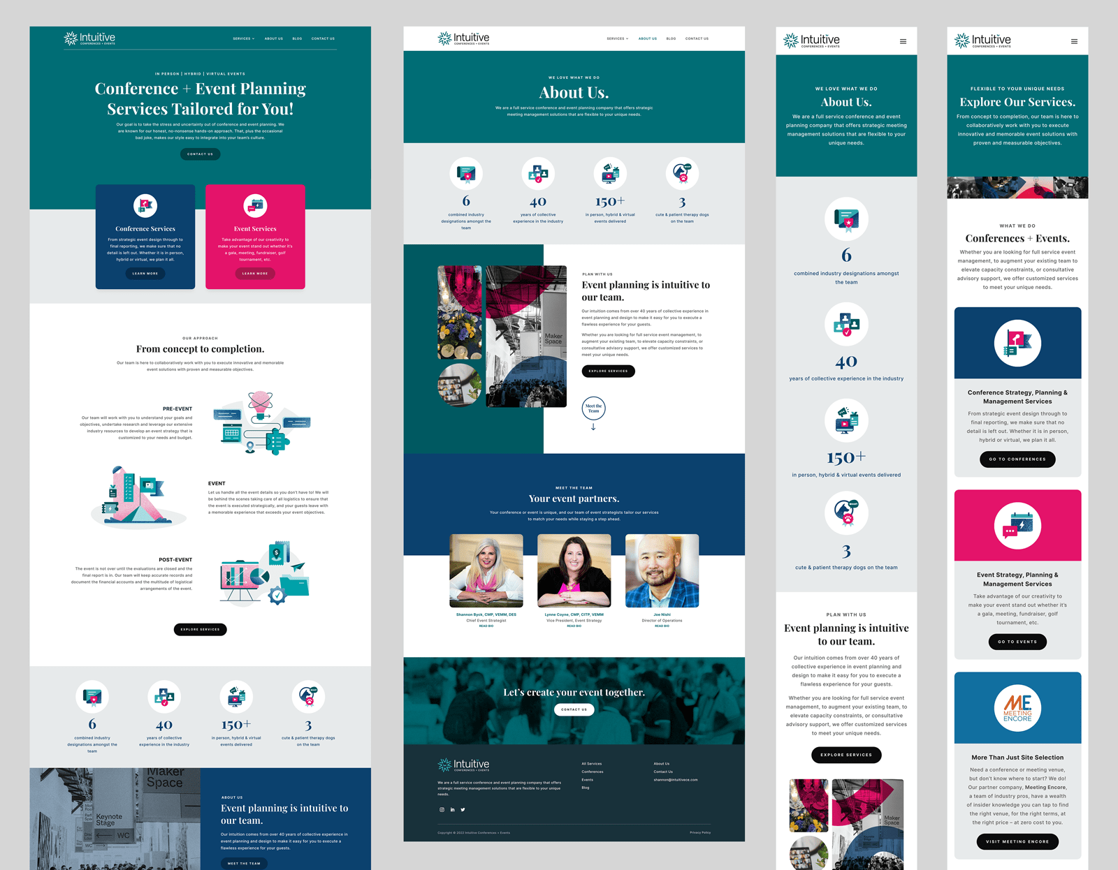
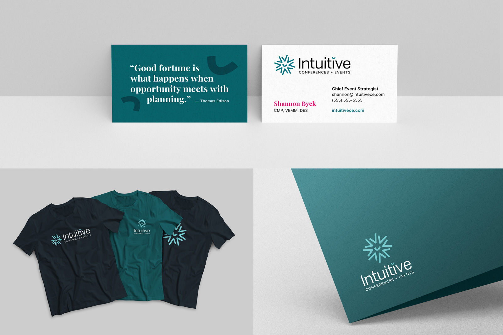
Applying the Brand
From a fully responsive website to business cards, a consistent application of the logo, colors, and typography is key to communicating a unified message.
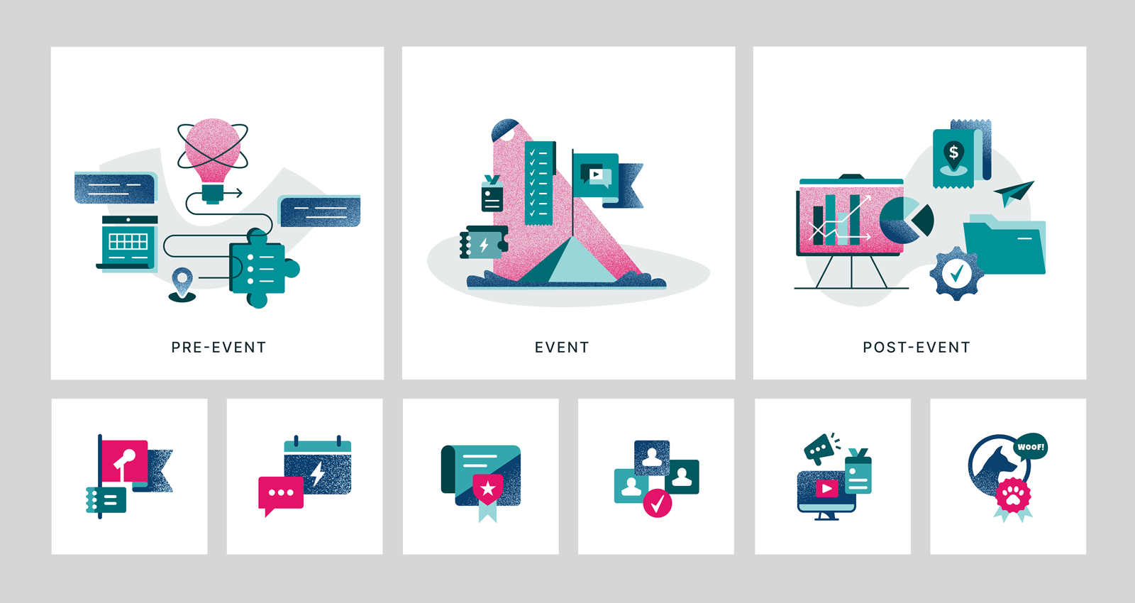
A set of illustrations was created to express the team's process: pre-event, event, and post-event. Along with a set of icons, these complement the brand colors and can be used on different mediums.
Have a job in mind?

design@isabelleparadis.com